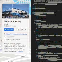
I’ve contributed to quite a few GNOME apps over the years, but Maps is the one I keep going back to. It’s a pretty easy codebase, and I’m a huge map nerd.
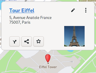
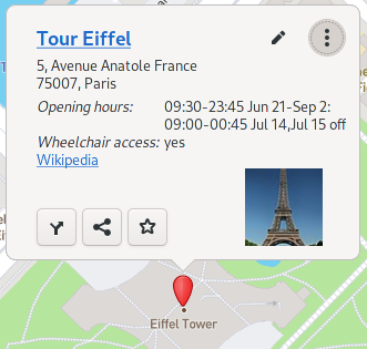
I’ve been wanting to give the place popover an overhaul for a while now. Here’s what it looks like in 3.38:
There were a few design issues I wanted to address:
- Most information is hidden initially. You have to click a button to see everything but the name and address.
- That picture is tiny! It’s usually just an icon, but the Eiffel Tower has a linked Wikipedia article, so we show a picture from that instead. But the picture is still icon-sized.
- The buttons are all over the place. Some are on the bottom left while others are on the top right.
- Overall, it looks disorganized to me, with inconsistent margins and stuff scattered in different places.
The New Design
Here’s what it looks like now:
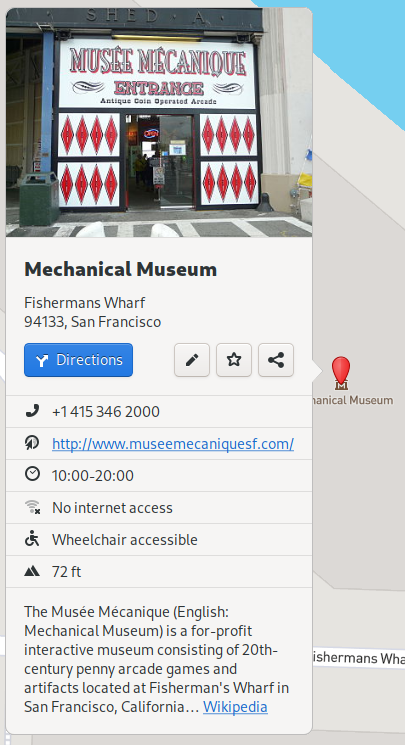
Much better, in my opinion! Thanks to Allan Day for his mockups, which took my initial, rough idea and made it actually look nice.
- The Directions button is blue and has a label, making it easier to find.
- Icons! Thanks to Jakub Steiner for the new wheelchair, toilets, and phone icons. These make it easier to scan for what you’re looking for in a potentially long list of information.
- The picture is much bigger, and takes a prominent place in the bubble rather than being put in timeout in the corner.
- The title uses Adwaita’s typography styles so it matches the rest of the platform. If you’re making a GNOME app and you have custom font styles, you should look into switching to the Adwaita ones.
- If the place has a linked Wikipedia page, we now show a summary along with the link.
Other Improvements
Some things specific to Contacts and Current Location bubbles also got redesigned:
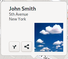
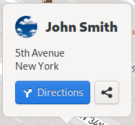
- Contacts’ bubbles now use HdyAvatar, which gives them a rounded shape and a default picture, to match the rest of GNOME.
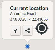
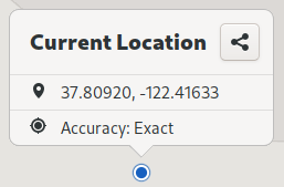
- The Directions button has been removed, since it doesn’t make much sense to get directions to where you already are.
- If you use the Facebook/Foursquare check in feature, it has been moved to the Share screen.
Conclusion
This is one of my biggest contributions to date, and I’m thrilled about how it turned out! Many thanks to Marcus Lundblad, Maps’ maintainer, for assisting me with and reviewing this enormous merge request.
In a future merge request, I plan to make the place bubbles adaptive, so they can work on mobile devices. Hopefully this will also make it in time for GNOME 40, which is scheduled to release next March (2021).
